Case Study 06
What Are We Even Doing?
Redesigning a corporate website to carry clearer purpose communication for two distinct audiences.
- UX Design
- Web Design
- Content Strategy
- Role
- UX Designer
- Content Strategy
Only design role on a 5-person team
- Team
- CEO
- Lead Dev
- Backend Dev
- Frontend Dev
- me
- Stack
- Figma
- Adobe Illustrator
- Adobe Photoshop
- Status
- Pre-launch handoff (Q1 2025 launch slated)
- Span
- Jan to Jun 2024 (20 weeks)
01
The Trigger
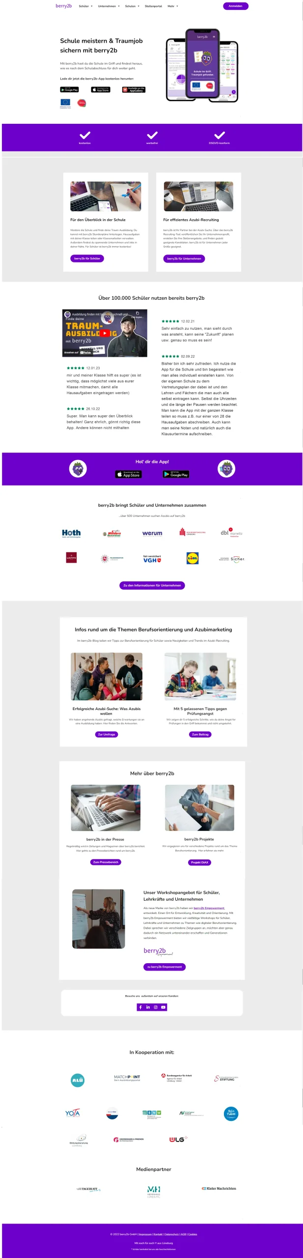
High bounce, low conversion, no scrolling past the fold. Sales reps spent call time explaining what the product even was.
02
Research
User testing with both audiences, heatmap analysis, and cross-functional stakeholder interviews across marketing, sales, leadership, and engineering. Two personas anchored the work: a recruitment manager looking for young professionals, and a secondary-school student looking for vocational training.

Anna Graf, 40
Recruitment manager at a timber construction firm with over 300 employees, Hamburg
"We need a more efficient way to connect with the right candidates."
Goals
- A steady pipeline of young professionals and apprentices
- A recruitment process that fits a busy schedule and a set budget
Pain points
- No way to tell which of the many job platforms reach the right candidates
- Waiting passively for applications instead of engaging candidates

Walid Saleh, 17
Secondary-school student in Hanover, actively looking for vocational training
"I want to do something meaningful after school, but I feel lost and unsure about my options."
Goals
- Something meaningful after school
- A job that lets him support himself and his family
Pain points
- Pressure from his father to go into construction
- No clear picture of his own strengths
- Little career guidance and tight family finances
03
What I Tried First
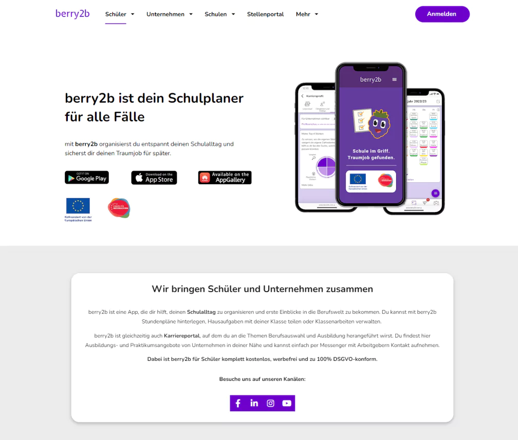
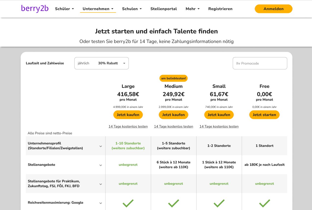
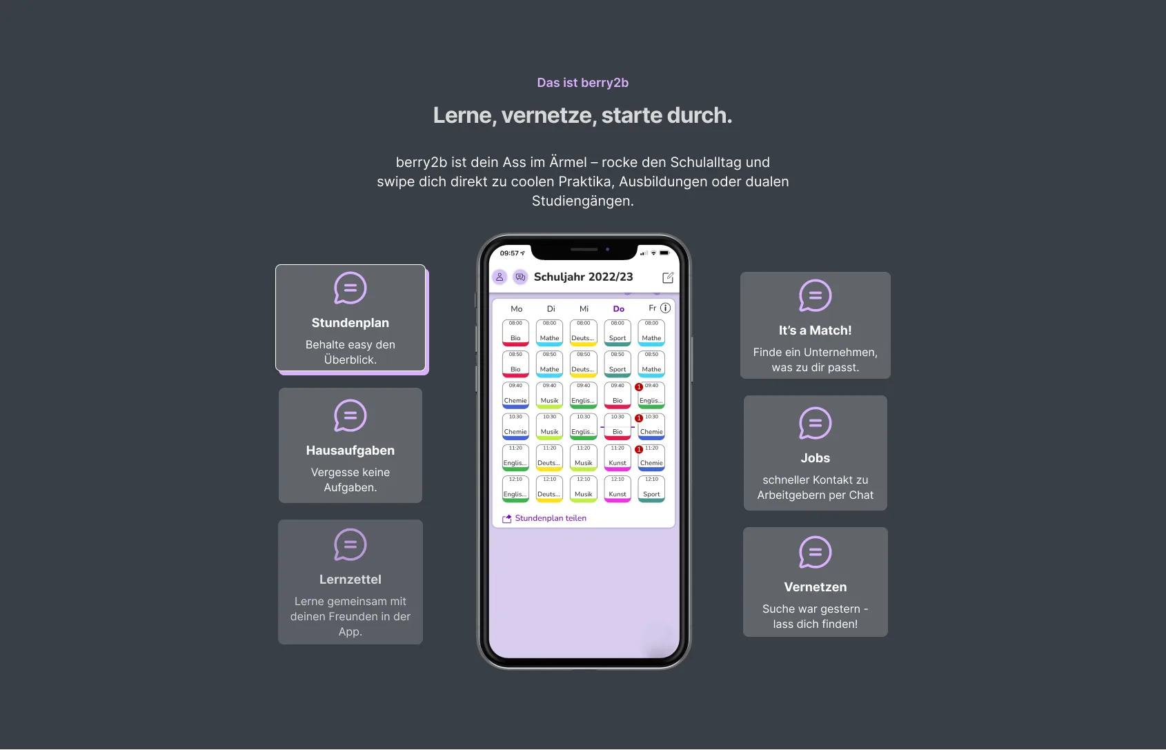
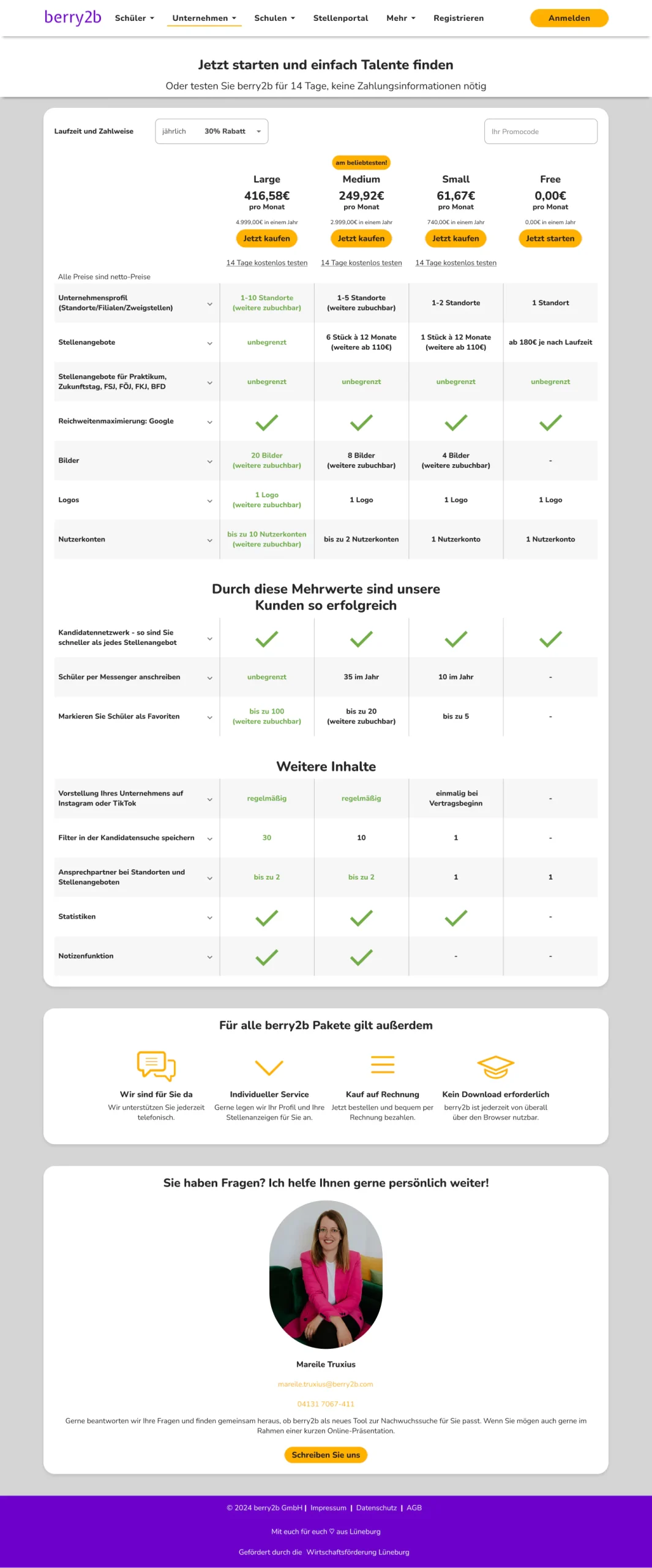
One homepage for both audiences. A dual-purpose hero ("Master your school day and find your dreamjob"), dense feature lists, every pricing feature on one screen, the existing "school planner" framing kept as-is. I put that version in front of users before changing anything.
What testers said
"The homepage does not really tell me if this is for me as someone who’s looking to recruit."
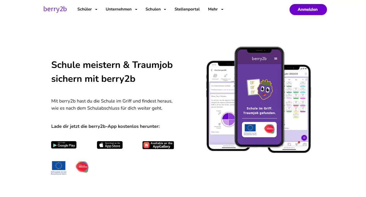
"Ok, so this says “school planner”, but I don’t quite know what that means."
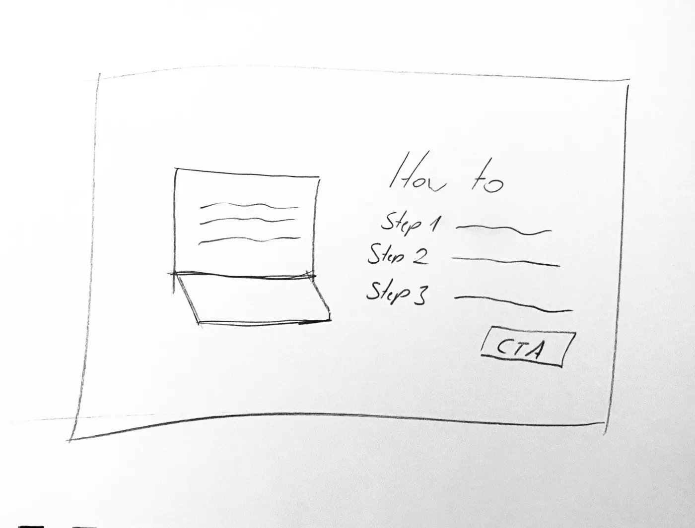
"I don’t even understand what it is that you’re doing, so I don’t really feel like reading a step by step tutorial right now."
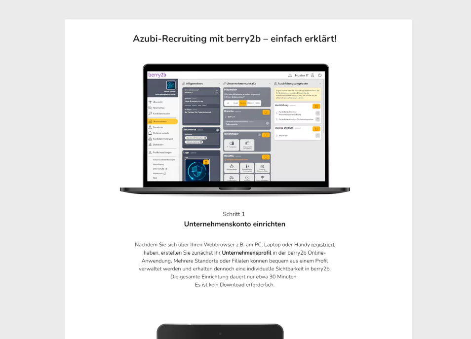
"I have a hard time figuring out what half of these features are, so I wouldn’t want to register without more info."
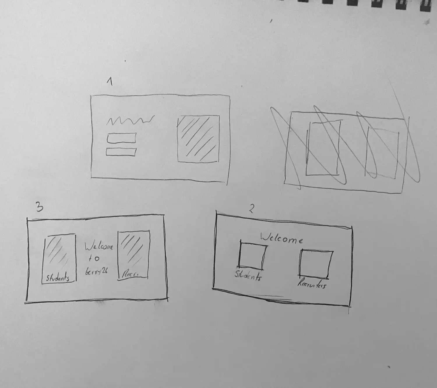
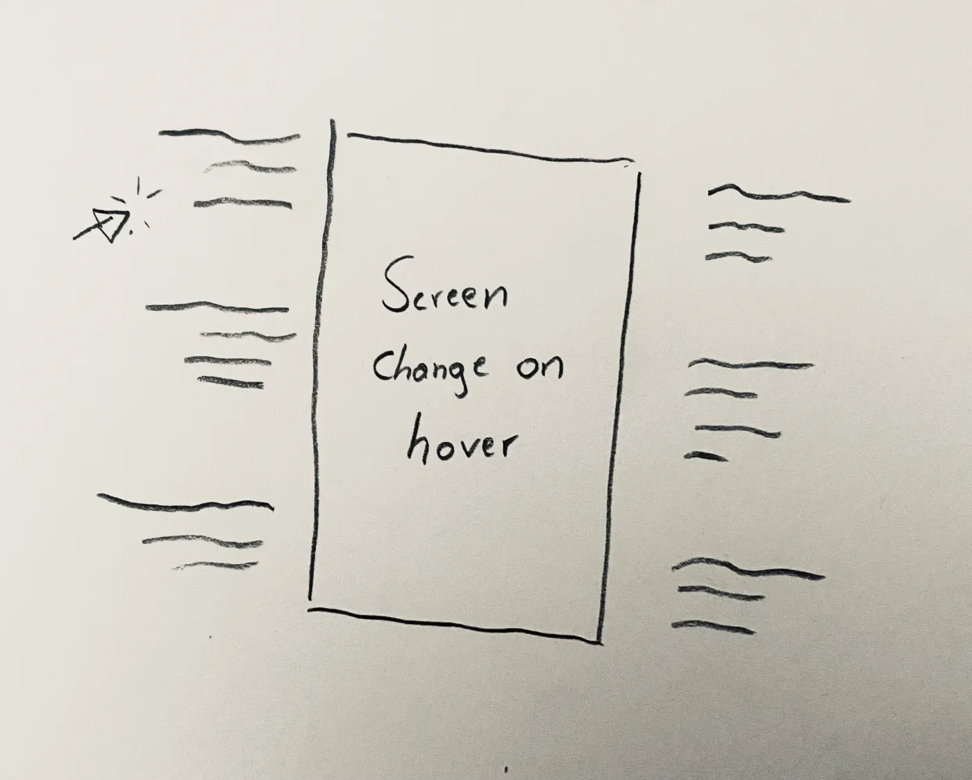
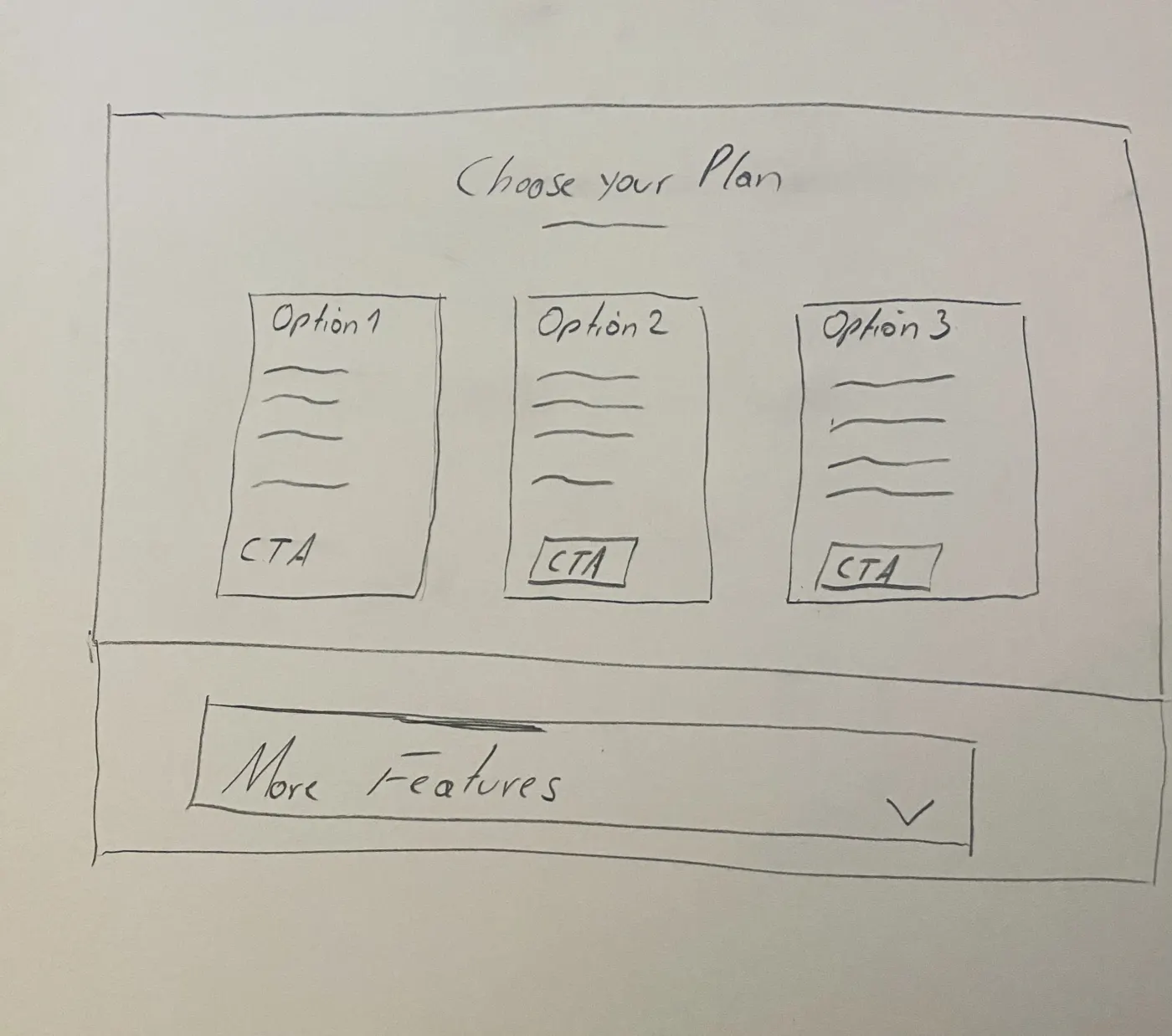
First sketches
Each sentiment got a pencil answer before any pixels moved.
04
What Broke
Testing exposed the compromise as unworkable. Neither audience recognized themselves; dense explanations made participants disengage before they could learn what the platform did.
05
What I Changed
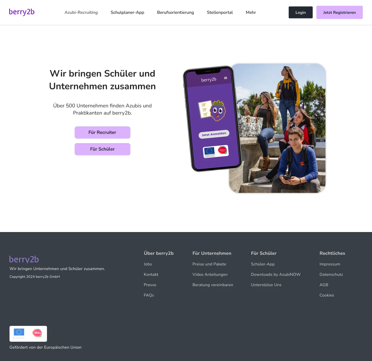
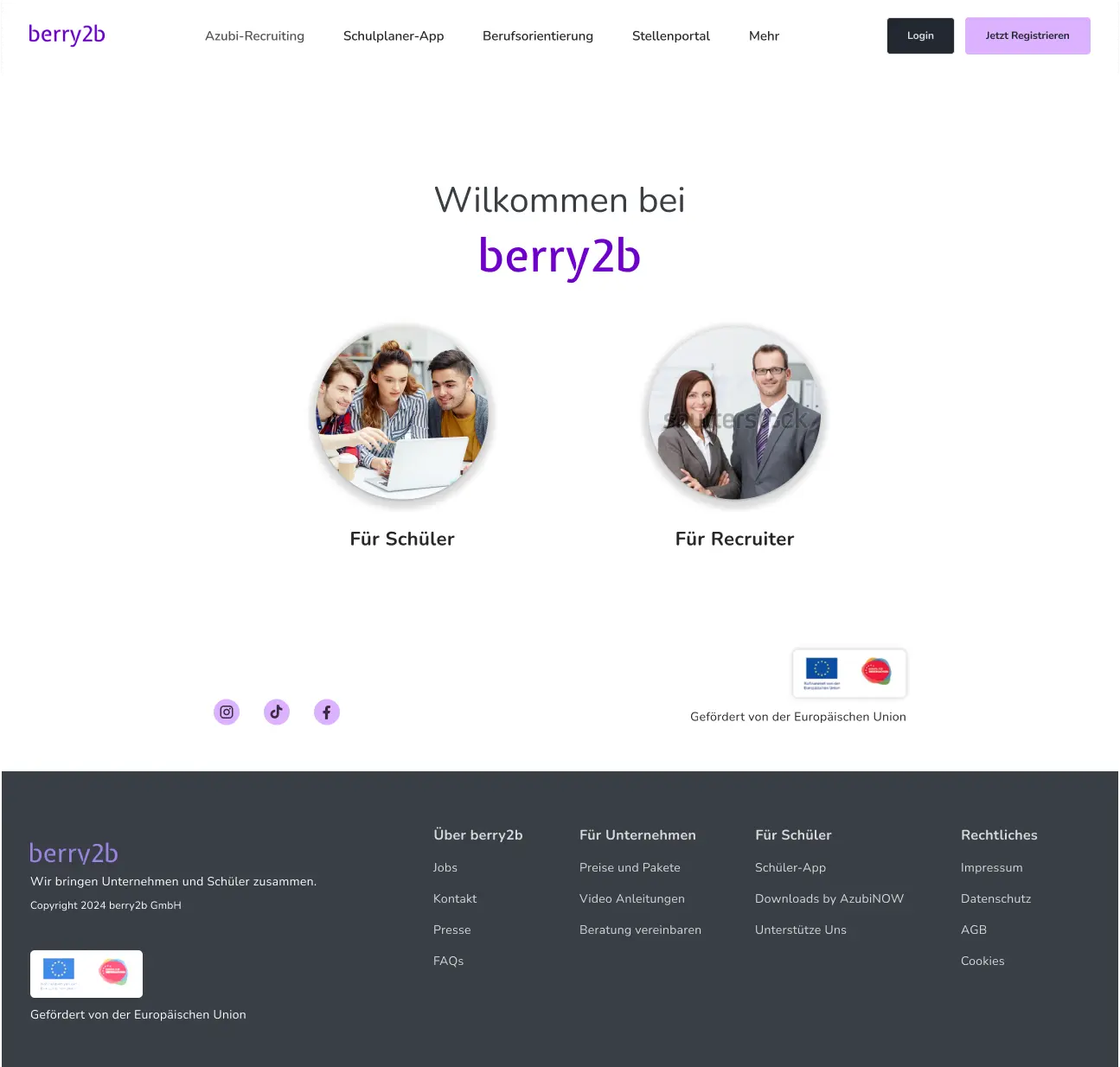
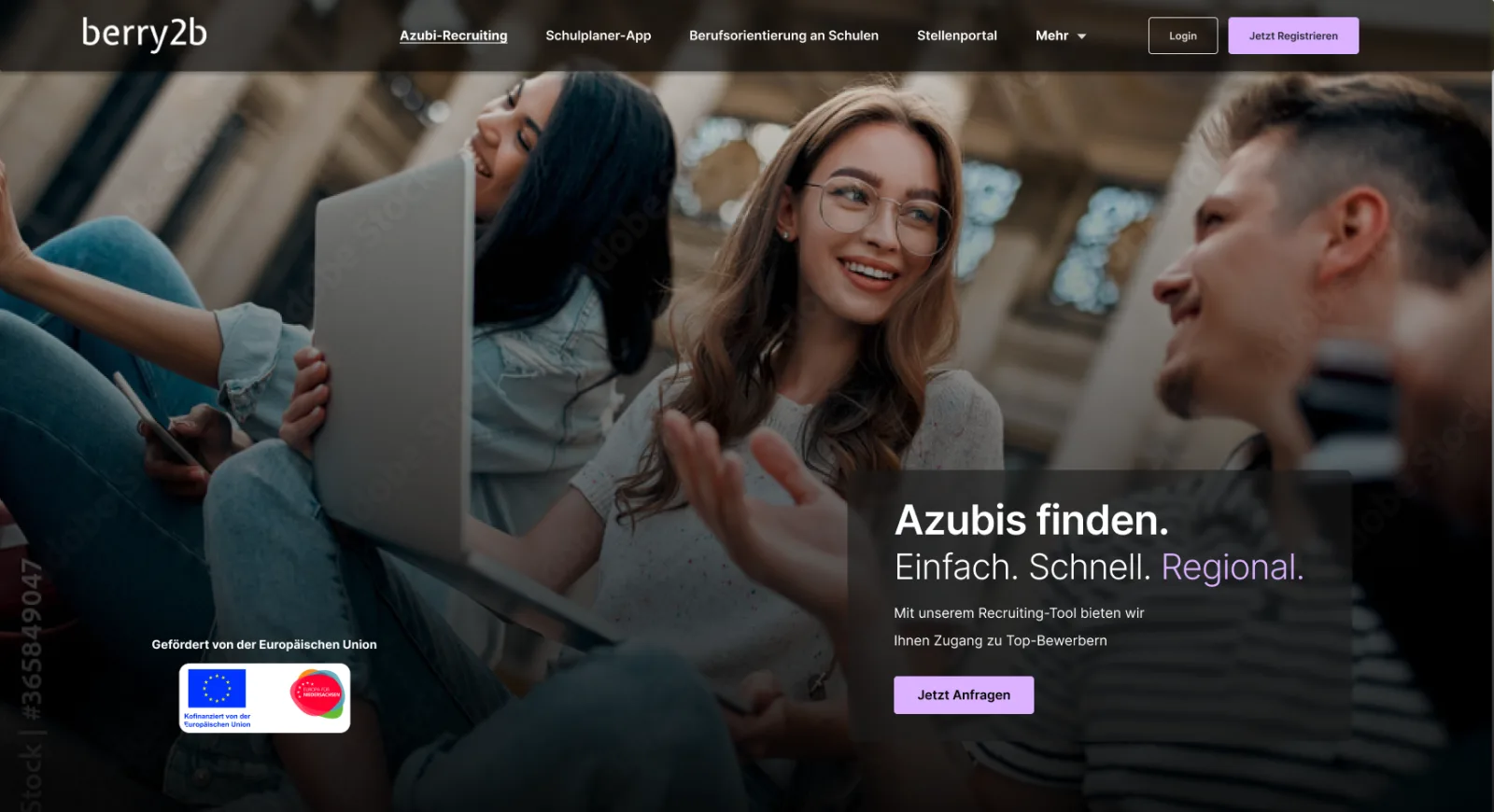
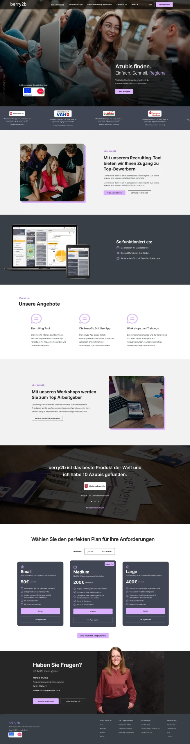
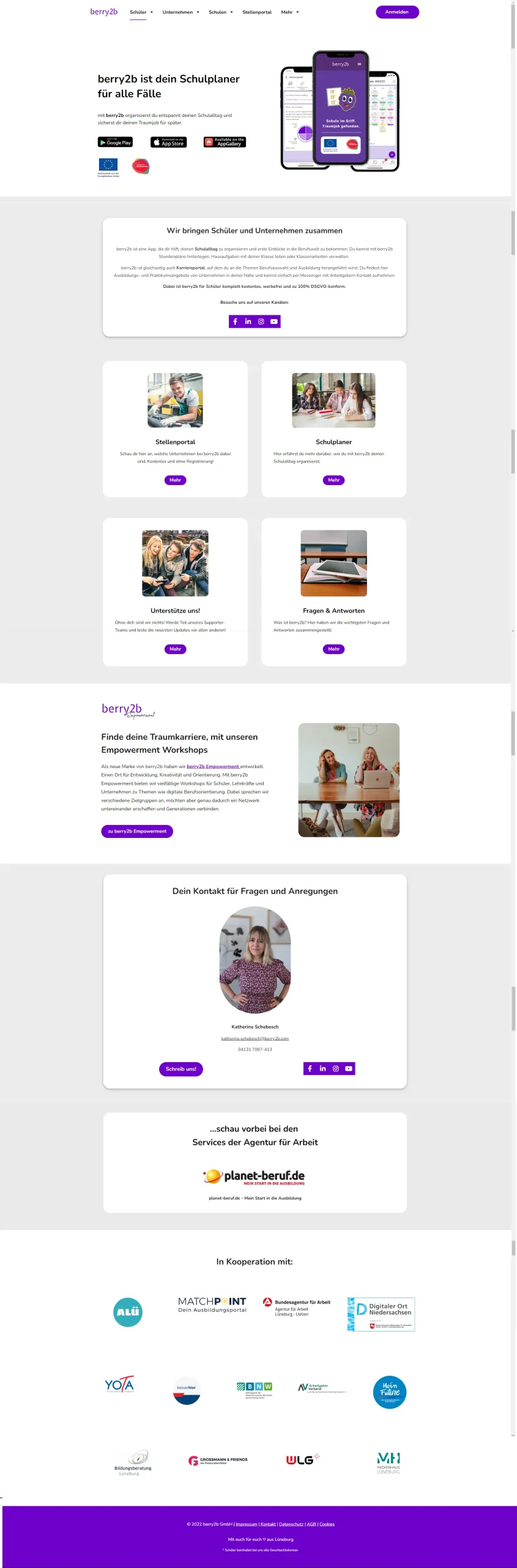
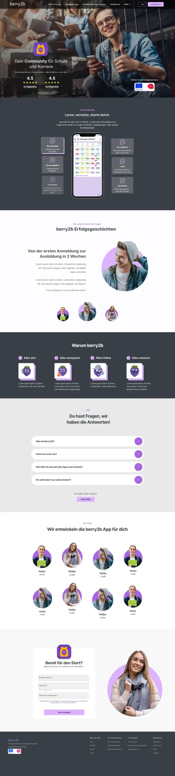
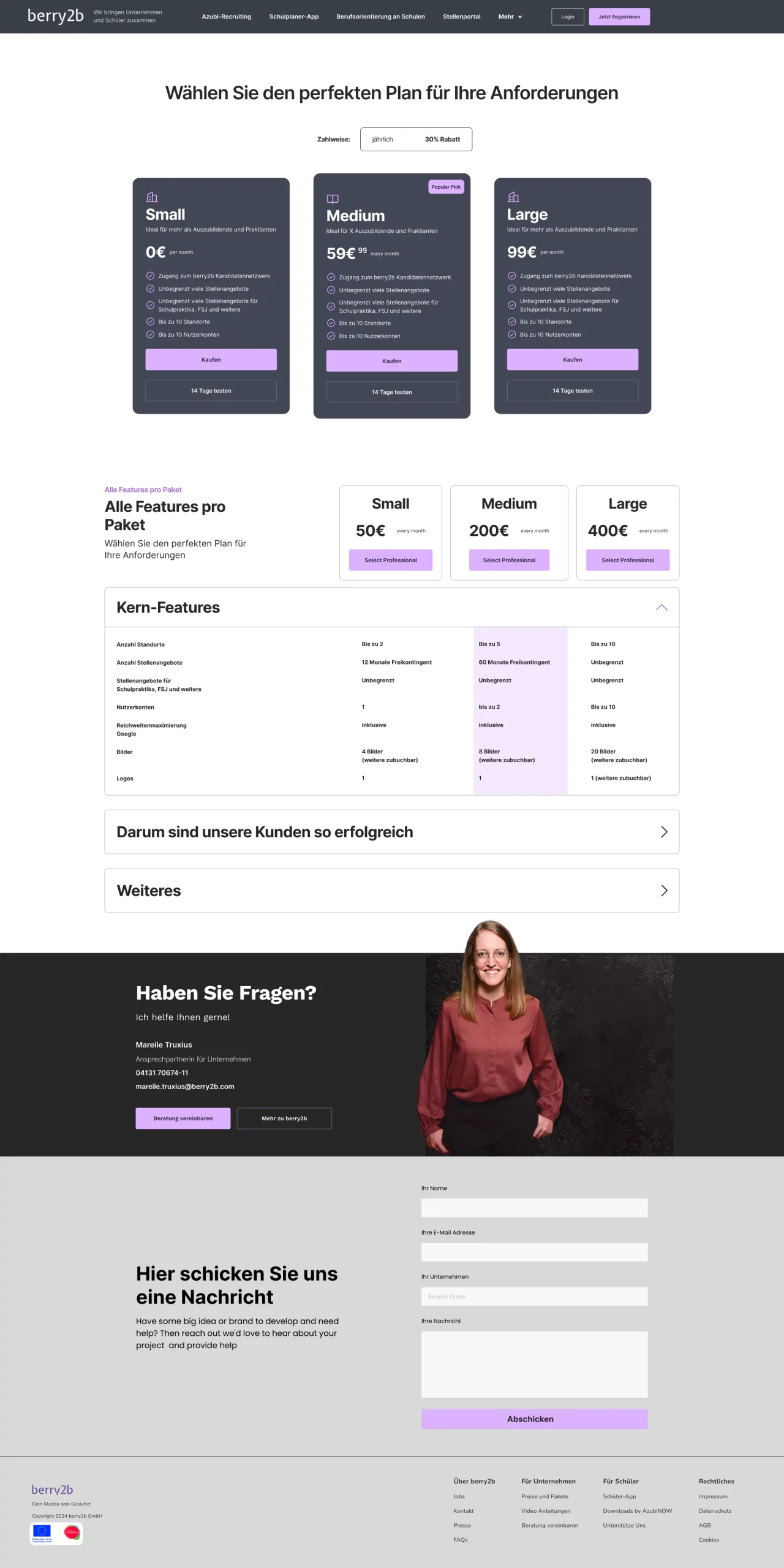
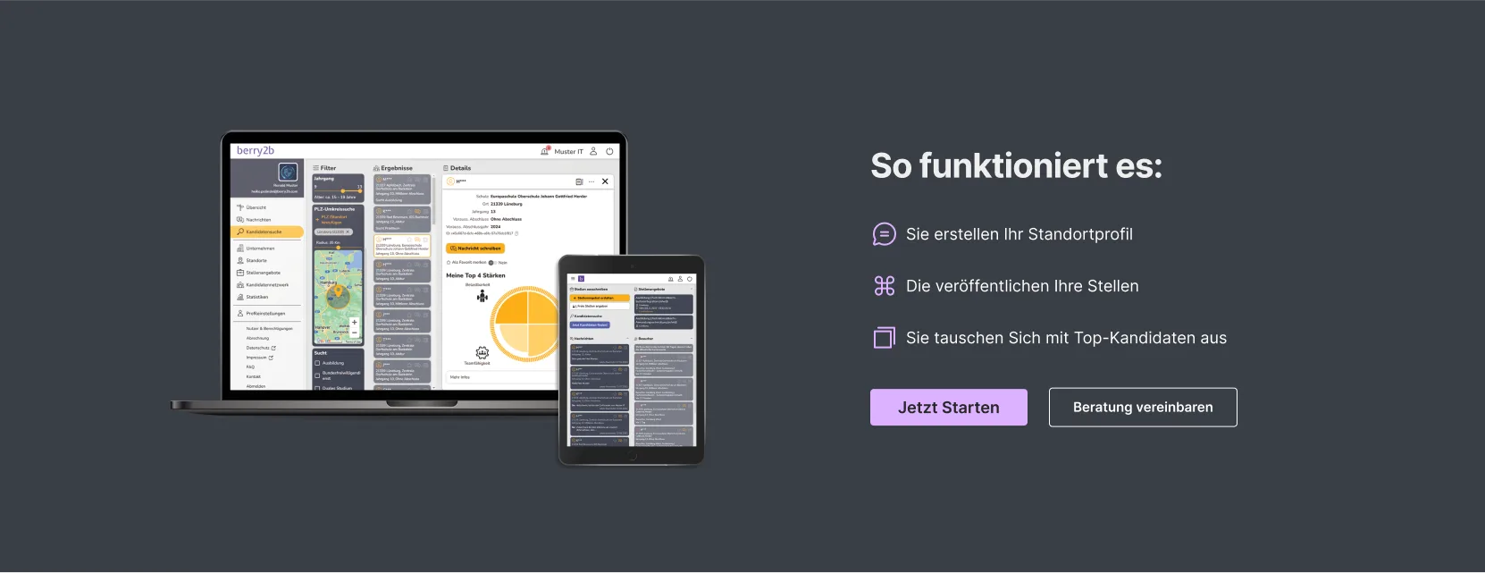
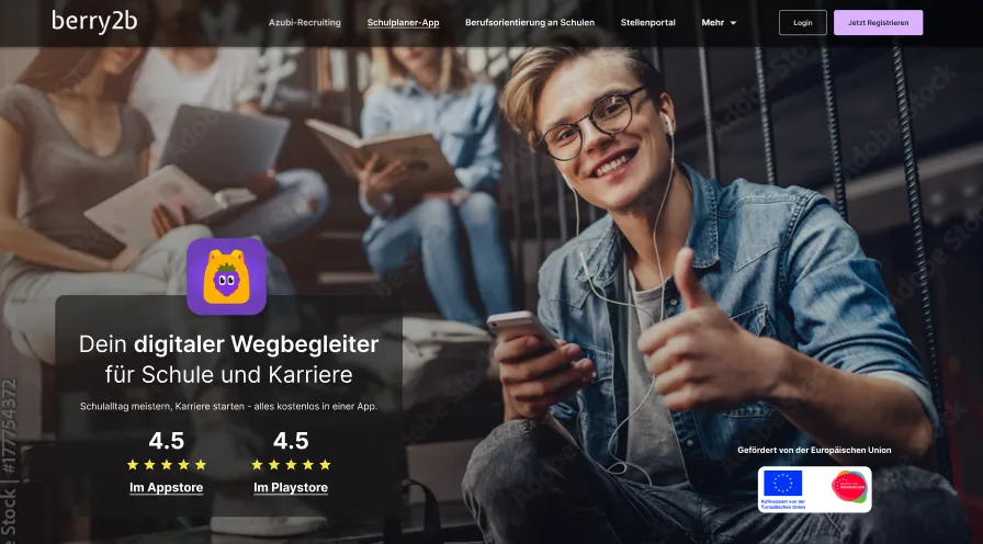
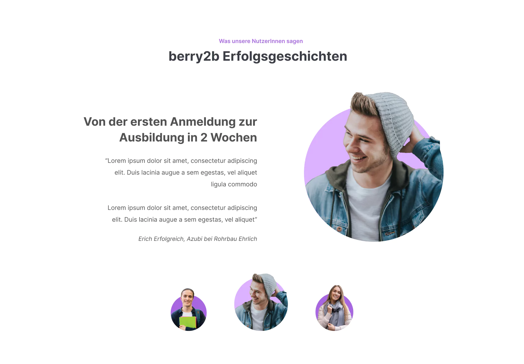
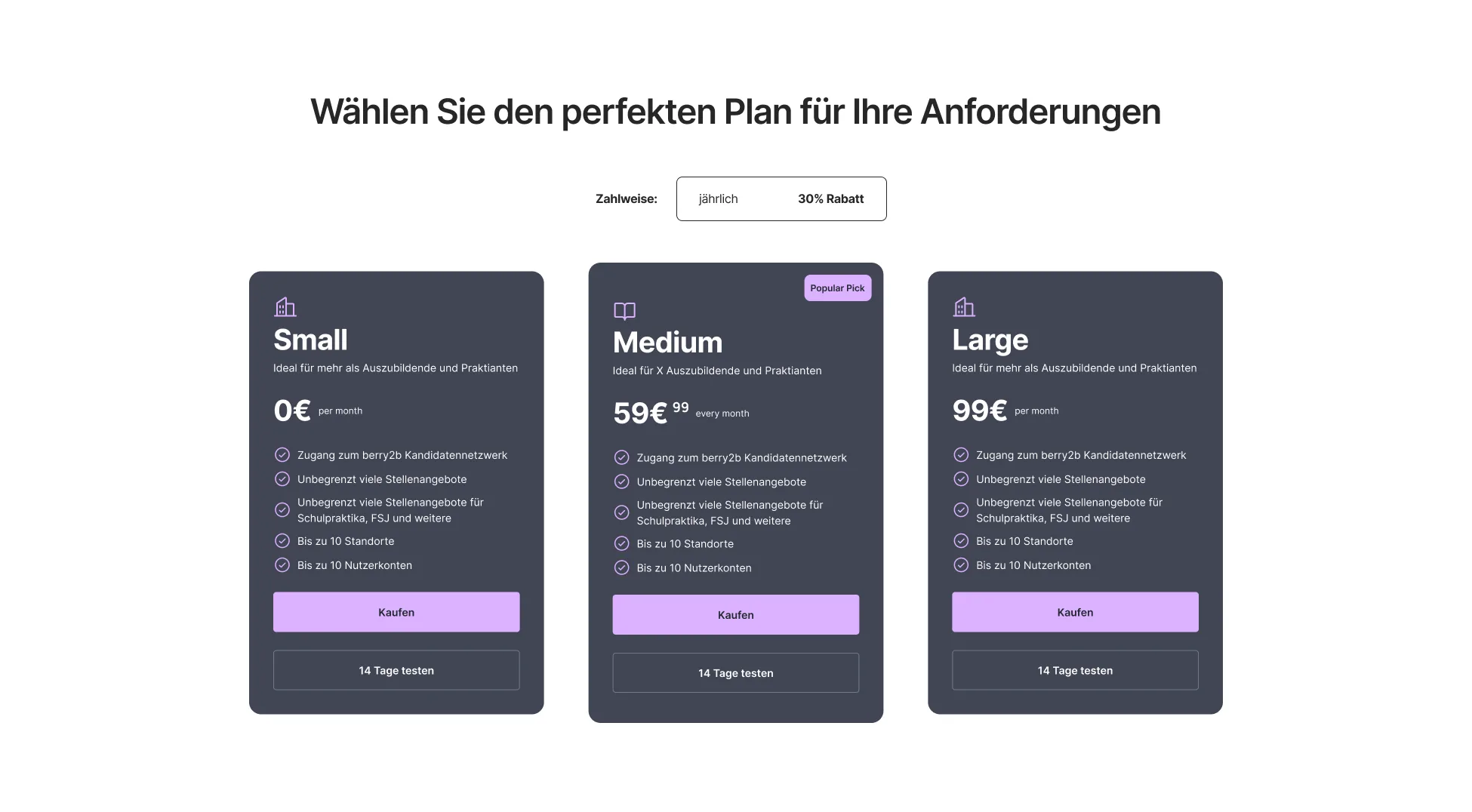
Messaging tuned to each audience separately. The homepage opens with a role-selection step, then each audience gets its own page: recruiter-focused with a clear hero, student-focused with show-don't-tell visuals and social proof. Pricing surfaces five core features by default.
Quiet design choices
- Visitors pick their own path from the homepage before reading any audience-specific copy
- Tone shifts between sections (professional for recruiters, exploratory for students) while typography and palette stay shared
- The student page replaces tutorials with show-don't-tell visuals and social proof, since dense explanations were the deterrent
- Pricing surfaces five core features by default, with deeper specs available on demand instead of crowded into the default view
- Testing was built in before launch so confusion could be caught against the redesign rather than discovered after it
06
Result
Before and after
Every core page was rebuilt around the routing idea. Drag the slider in each pane to move through the full page.

Final designs
Defensible numbers
- Sixteen participants in post-redesign usability testing (ten students, six recruiters)
- 16 / 16 identified their role correctly on the homepage role-selector
- 6 / 6 recruiters correctly identified the recruiting-tool function on the business page after the redesign
- 5 / 6 recruiters could name the important features
- Stakeholder alignment confirmed across marketing, sales, leadership, and engineering
Qualitative
Testers self-identified the right path unprompted. Participants explained the pricing value bands back to me without facilitation.
"Ok, so you have something for students and recruiters. I am a student, so I’m just going to click on “student”."
"I’m guessing that you’re an agency that has developed an app for students."
"So this looks like a tool that lets me access a database of students?"
"It looks like the main difference between the pricing bundles is that they are for companies of different sizes?"
What I didn't measure (and won't fake)
- Post-launch bounce rate, session duration, and conversion deltas. The redesign was a pre-launch handoff, so traditional success metrics weren't available at writeup time.
- Long-term SEO performance, same reason.
- Sales-call time saved post-launch. The reduction is a forecast based on testing comprehension, not a measured outcome.
07
What I Learned
The redesign was a content problem before it was a design problem. The reframes below carry into any audience-routing site.
Carried over to the next system
- Audience routing is a content problem before it's a design problem. A clean IA can still confuse a reader if the copy refuses to pick a side per moment.
- "Which path is mine" is the test that matters when two audiences share a homepage. Beauty and clarity rank below self-identification.
- Simplification beats comprehensiveness on a pricing page. Cutting features off the default view made the value bands legible in a way listing everything ever did.
- Structured user testing exposes the gap between designer assumption and user understanding earlier than internal critique. A small session (10 to 20 participants) is enough to catch a wrong frame.
What I'd do differently
- Run the "self-identify your path" test before any visual design. The wireframe stage is already too late to discover the copy can't carry the routing.
- Build a single landing per audience early. The single-homepage compromise made the IA harder than it needed to be.
- Treat cross-functional stakeholder input as research, not approval. Marketing, sales, leadership, and engineering each hold pieces of the audience picture that no one role sees alone.
Case Study 06 Clear
Thanks for reading. If you want to talk about this work, reach out any time.