




Case Study 02
Say Hi to Berry
Giving a student app a mascot and gamified progression so users came back on their own, co-designed with the students themselves.
- UX Design
- Gamification
- UX Research
- Role
- UX Designer
- Illustration
- Team
- CEO
- Lead developer
- Backend
- Frontend
- UX (me)
- Stack
- Adobe XD
- Illustrator
- After Effects
- Lottie
- Status
- Launched
- retention measured 2 months post-launch
- Span
- Early 2022
- 10 weeks
01
The Trigger
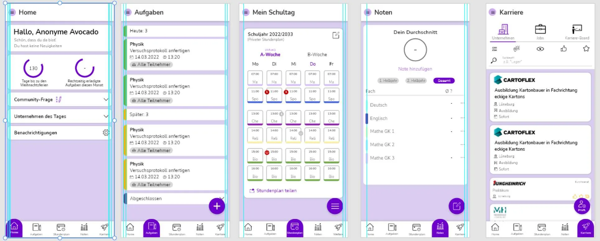
A recent visual overhaul had made the student app look better without making anyone come back. Thirty-day retention sat at 8 percent against a 12 to 15 percent category benchmark, and the store rating had stalled at 3.9. The app looked fine, but it gave students no reason to return.
02
Research
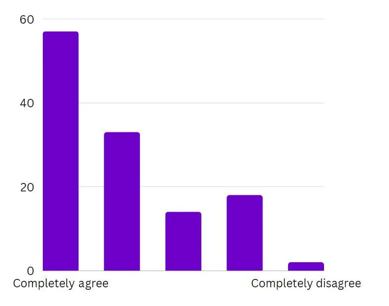
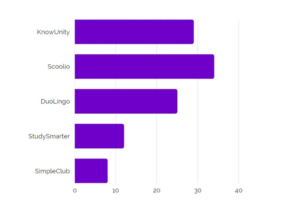
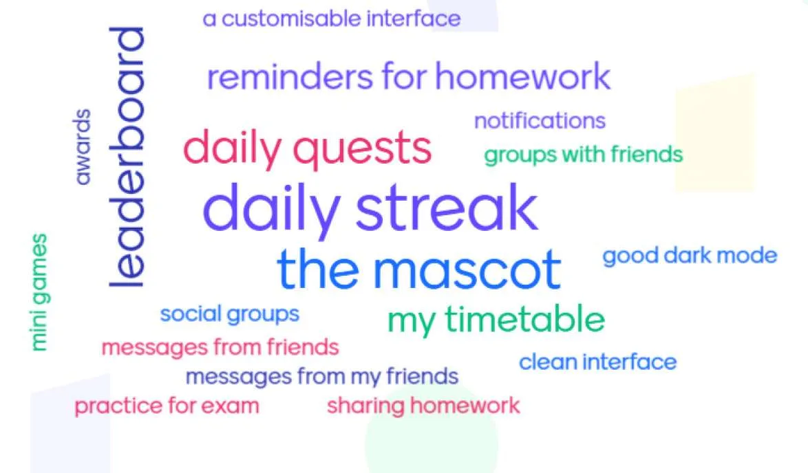
The focus groups brought together twelve students aged fourteen to eighteen; a survey reached a hundred and four more. The teardown of Duolingo, Knowunity, and Scoolio mapped what regular-use apps did that berry2b didn't. The through-line was an emotional-engagement gap: students found the app useful but had no relationship with it, and they responded strongly to mascots, achievements, and a visible sense of progress. Because every participant was a minor, the research ran on explicit consent, anonymized data, and the option to drop out at any point.
research timeline · five weeks
Virtual focus groups
1 week
Online surveys
2 weeks
Competitive analysis
1 week
Data analysis
1 week

Svea Heilandt, 18
12th-grade Gymnasium student in Düsseldorf, months from graduation, not actively looking for vocational training
"As graduation approaches, I want to enjoy my time with friends and explore my options before deciding on my next steps."
Goals
- An app that helps her manage her academic and personal life efficiently
- Career guidance for later that respects her current focus on friends and hobbies
Pain points
- Balancing the search with school creates stress; she wants a streamlined solution
- No real career orientation at school, so university feels like the only known path
- Pressure to plan her future while time is short before graduation
03
The Frame
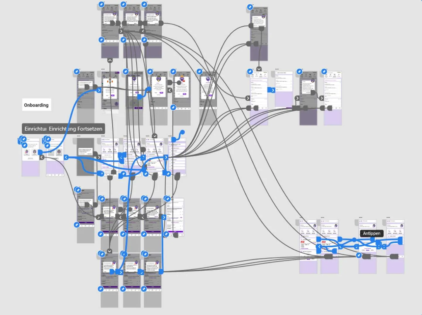
The brief collapsed into a single question: how might we make berry2b engaging enough that students come back on their own? Research pointed at five directions worth testing, a guiding mascot, a customizable play space, quests, achievement badges, and notifications that read like a person rather than a system.
04
Co-Design
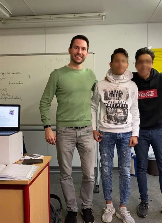
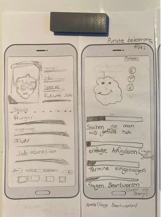
Rather than design these in isolation, I ran four participatory workshops with twenty-five students who sketched avatar outfits, proposed quests, and reacted to early mascot directions. The students weren't validating finished work, they were generating it. Their pull toward a guiding character is what turned berry from a nice-to-have into the spine of the whole system.
From sketch to mascot
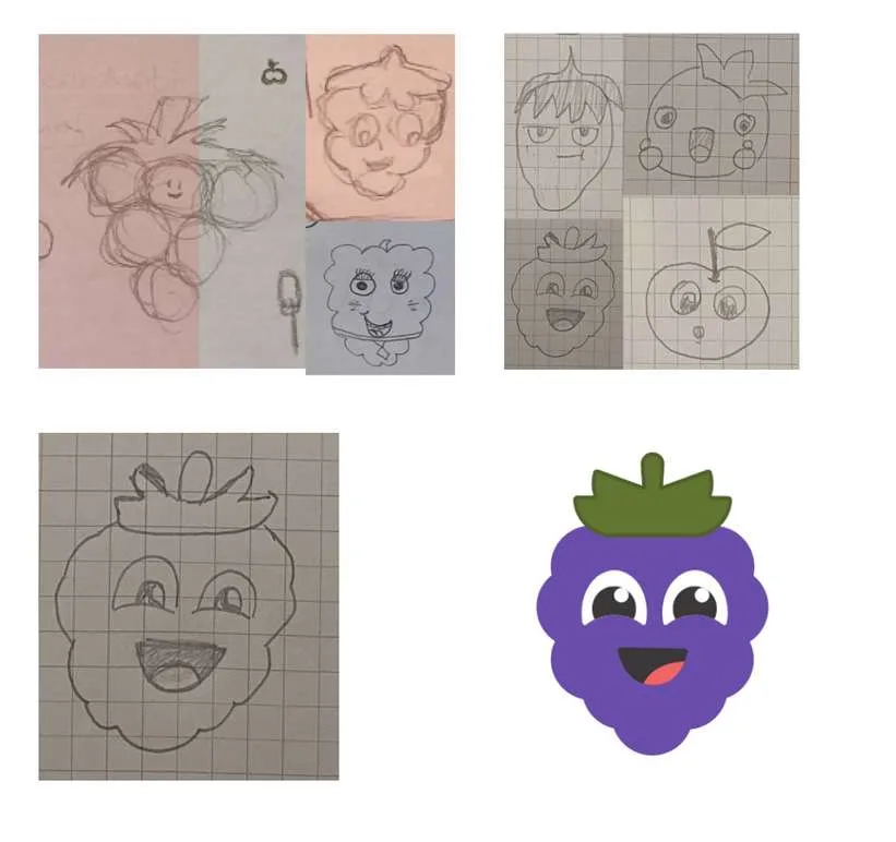
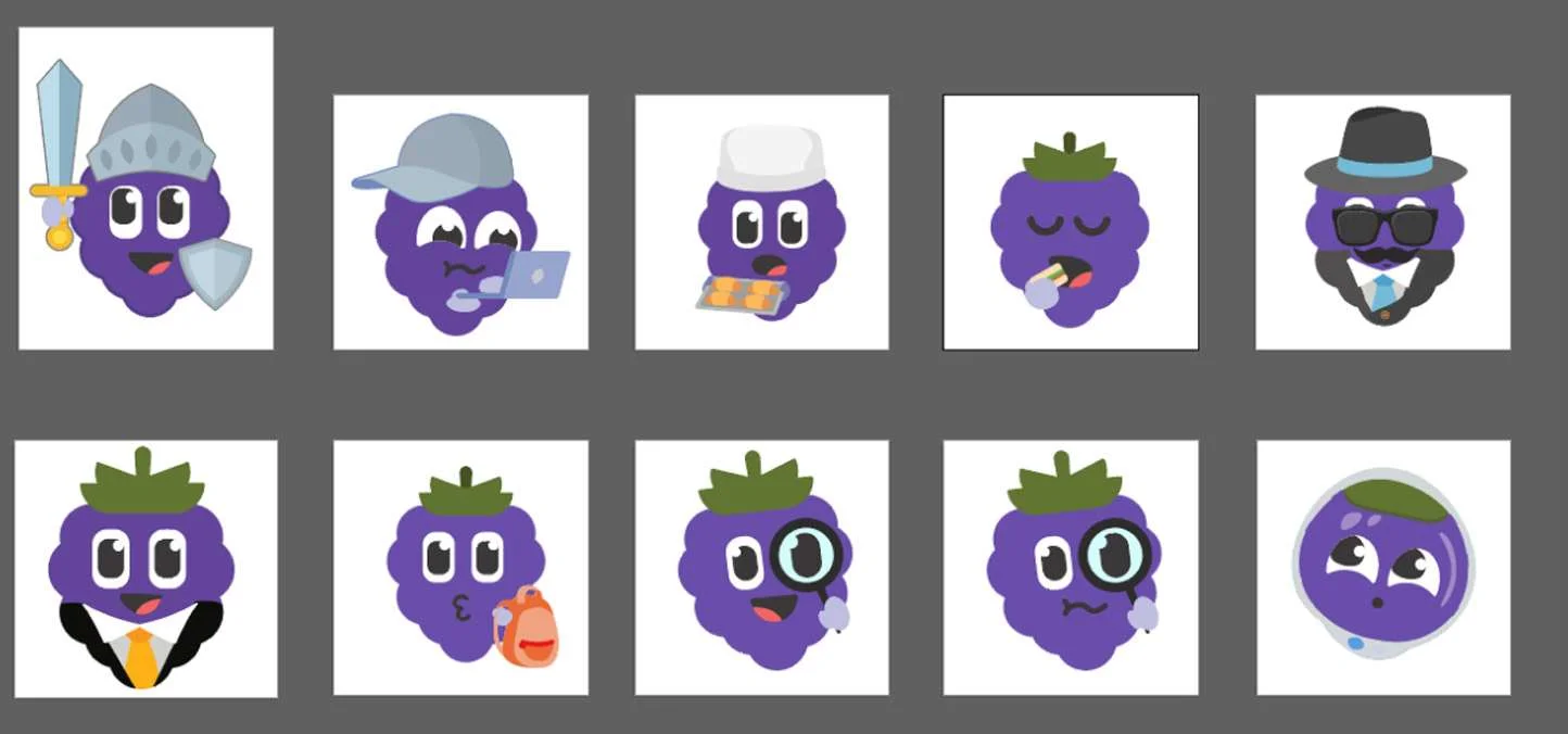
berry began as pencil sketches, several of them drawn by the students themselves. A berry-themed character emerged as the favorite, then went through design iterations, five-second tests, and an Instagram poll before the final concept landed.
05
What I Shipped

Five features shipped, each traceable to something students asked for. I tested every direction before it landed, five-second reads on avatar designs, an Instagram poll on the mascot, and prototype rounds returned to the same students who co-designed them.
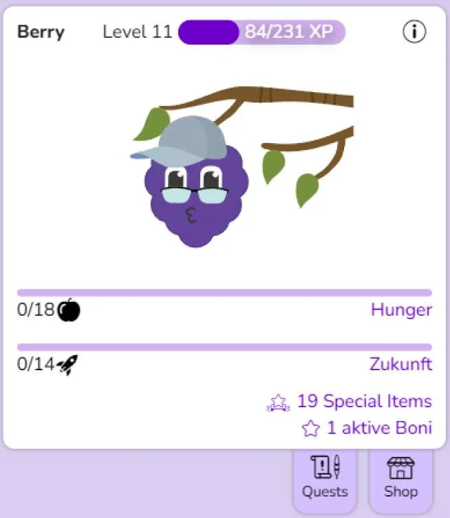
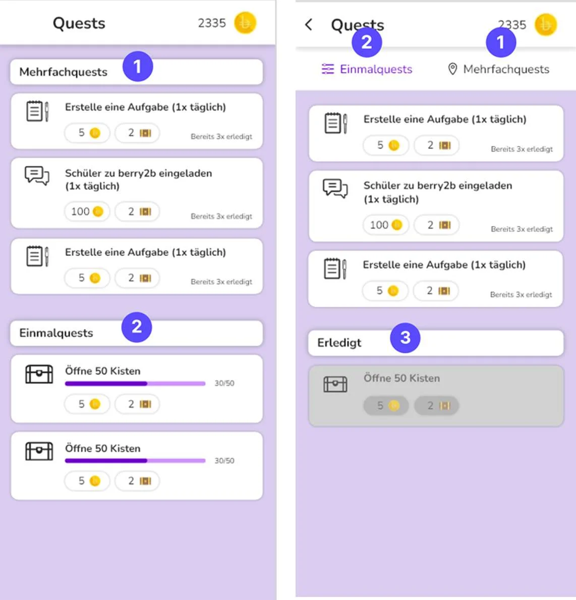
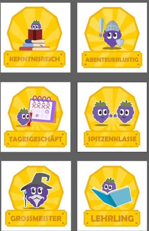
The five features
- berry, a mascot that guides onboarding, celebrates wins, and fronts every notification
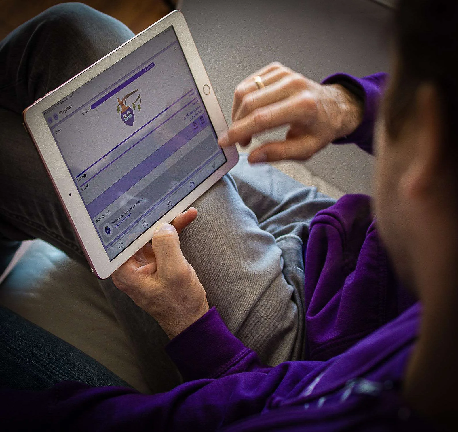
- Playzone, a customizable space where students dress their avatar with earned outfits
- A quest system that turns routine tasks into short, rewarded goals
- Achievement badges that mark real progress against milestones instead of empty rewards
- Notifications rewritten in berry's voice so nudges read as friendly rather than nagging
Quiet design choices
- Lottie micro-interactions gave berry enough motion to feel alive without bloating the app
- Badges attach to milestones students actually care about, so progress stays honest
- Every gamified surface was co-designed and tested before it shipped, not added on faith
Handoff
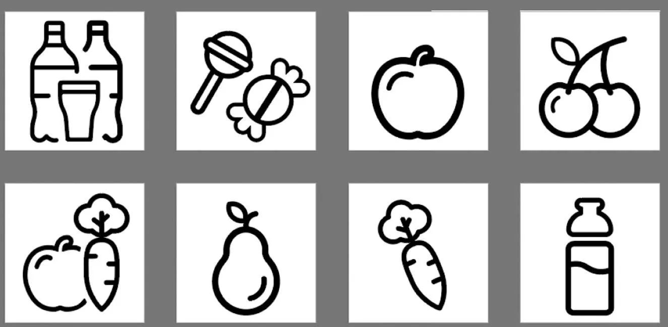
Development received finalized mockups, a gamified icon library, and a refreshed set of reusable UI components, so the new features shipped as one coherent system rather than bolted-on extras.
06
Result
Defensible numbers
- Thirty-day retention rose from 8 percent to 12 percent, measured two months post-launch, landing inside the category benchmark
- Store rating rose from 3.9 to 4.3
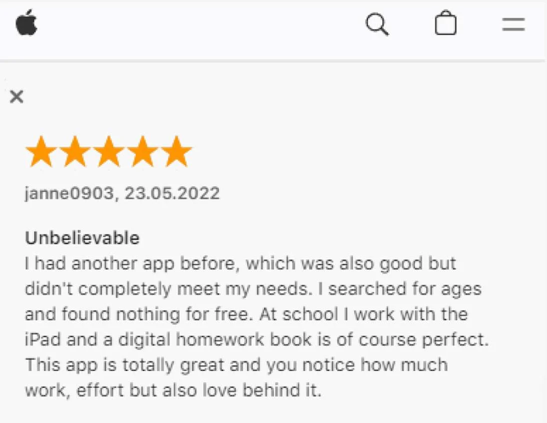
- Reviews named berry and the new interactivity as standout improvements
- Grounded in 104 survey respondents, 25 workshop co-designers, and 12 focus-group participants
What I won't overclaim
- The research cohort skewed regional and toward students already familiar with the app, so the retention lift is real but measured on a friendly audience.
- There was no long-run retention curve past the two-month window at writeup time.
- The lift is attributed to the redesign as a whole, not isolated to any single feature.
07
What I Learned
Engagement wasn't a visual problem, it was a relationship problem. The reframes below carry into any product trying to earn a return visit.
Carried over to the next system
- Co-design beats designing-for. The strongest feature in the app was the one students kept reaching for, not the one I planned.
- Gamification only works when it's tied to real progress. Badges for nothing get ignored; badges for milestones get chased.
- A mascot is an interface, not decoration. Giving nudges a consistent voice changed how students received them.
What I'd do differently
- Recruit outside the existing user base to test whether the lift holds for cold users, not just familiar ones.
- Instrument the funnel to attribute retention to specific features instead of the redesign as a whole.
Case Study 02 Clear
Thanks for reading. If you want to talk about this work, reach out any time.